In E-commerce UX/UI Design, the goal is not just aesthetics—it’s about trust and conversion. For this project, my goal was to design a high-fidelity prototype for a luxury jewelry brand that balances visual elegance with intuitive functionality.
As a marketer with an engineering background, I approached this design with a “Mobile-First” mindset, ensuring that the user journey—from product discovery to checkout—is seamless across all devices.
Table of Contents
E-commerce UX/UI Design Strategy: Frictionless Shopping
To maximize engagement, I focused on three core UX principles:
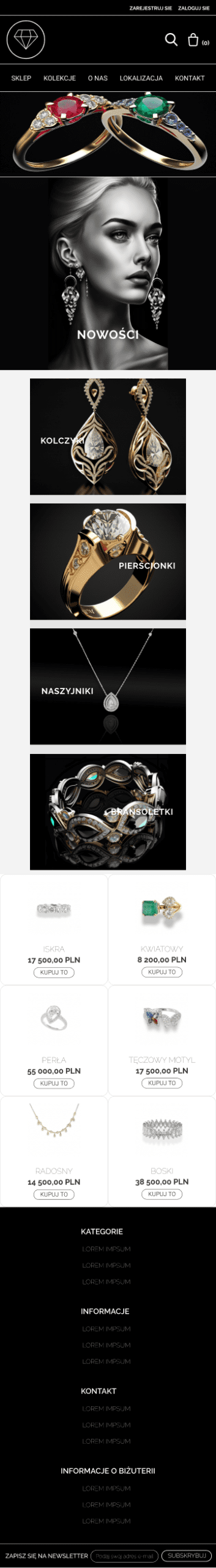
- Visual Hierarchy: High-quality imagery takes center stage to showcase the product details (essential for jewelry), while calls-to-action (CTAs) are clear but unobtrusive.
- Simplified Navigation: The menu structure is flattened to allow users to find categories (Rings, Necklaces) in fewer clicks.
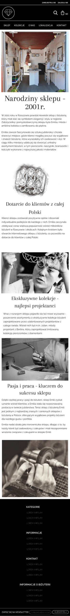
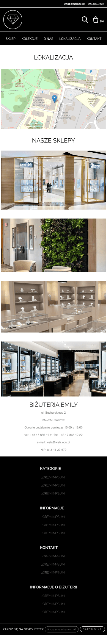
- Trust Signals: Strategic placement of “About Us” and location details builds credibility, which is crucial for high-ticket items.
Mobile-First Execution
Since over 70% of e-commerce traffic comes from mobile devices, I designed the mobile interface first. The challenge was to maintain the premium feel of the brand while stacking content for vertical scrolling without clutter.
Interactive Prototype (Explore the Design)
Static images can’t fully convey the user experience. Below is the fully interactive Figma prototype. Feel free to navigate through the store, view products, and test the checkout flow.
Note: If the prototype doesn’t load, you can [view the full project in Figma here].
Key Design Decisions for Conversion
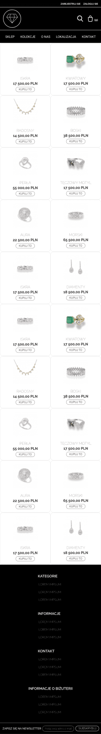
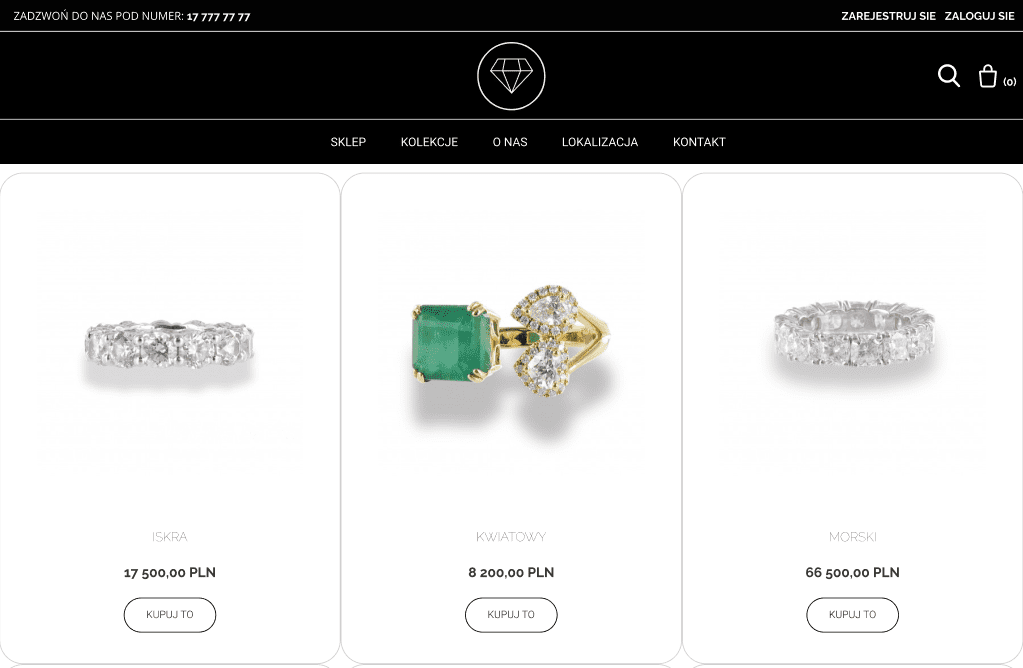
1. Optimized Product Listing & Hierarchy
The collection page is designed to answer all user questions “above the fold.” Price, name selection, and the “Buy” button are immediately visible. I used a clean, white background to ensure the product remains the focal point, reducing cognitive load for the buyer. Notice the prominence of the ‘Buy’ button. It contrasts correctly with the background to draw the eye immediately (CTA isolation).
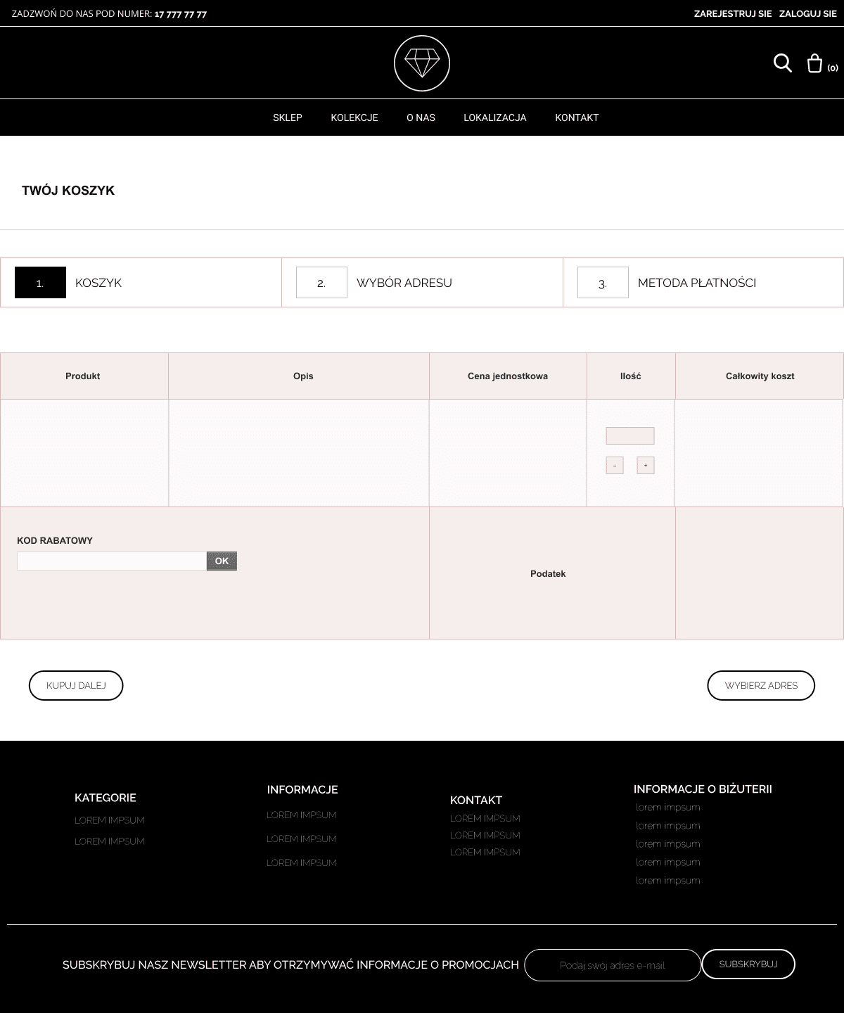
2. Distraction-Free Checkout Flow
Cart abandonment is a major issue in e-commerce. To combat this, the checkout process is stripped of unnecessary navigation links. The steps (Cart -> Address -> Payment) are clearly indicated at the top, giving the user a sense of progress and reducing anxiety. I also implemented a clear ‘Guest Checkout’ option visibility to prevent forcing users to register, which is a top reason for cart abandonment.
3. Lead Capture Strategy
Conversion isn’t just about immediate sales; it’s also about retention. To capture users who aren’t ready to buy yet, I placed a direct Newsletter Sign-up form in the footer. Instead of redirecting users to a separate landing page, the input field allows for a frictionless, single-step subscription process to build the email marketing list. (Visible on Fig. 3)
Visual Identity & Color Psychology
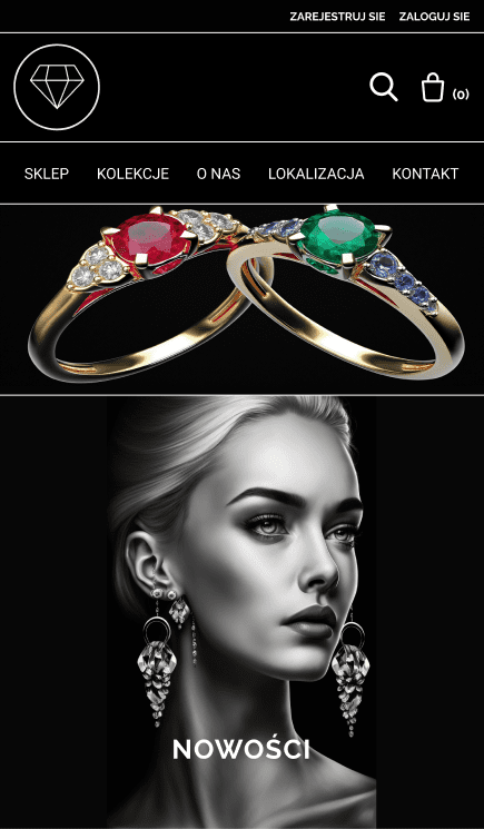
To evoke a sense of luxury and trust, I moved away from standard stark white interfaces. I utilized a deep, rich black background paired with gold and white accents for the UI elements. This high-contrast ‘Dark Mode’ aesthetic not only highlights the brilliance of the gemstones but also reduces eye strain, encouraging longer browsing sessions.
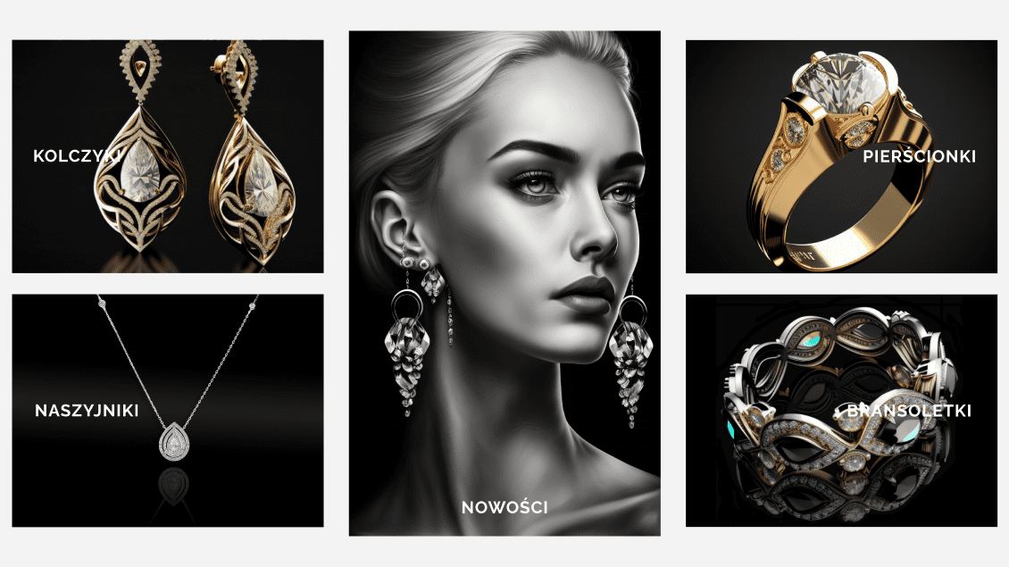
Figure 4: Visual identity showcasing the high-contrast aesthetic designed to reduce eye strain and evoke luxury.
Tools & Technologies
Executing a high-performing E-commerce UX/UI Design requires more than just creativity; it demands a structured workflow to ensure scalability and developer readiness. Here is the technical stack I utilized:
- Figma: For high-fidelity prototyping, UI design, and interactive flows.
- Grid Systems: Bootstrap (12-column grid) and 8-Point Grid System – used to ensure pixel-perfect alignment and easy developer handoff.
- Component Libraries: Vuetify, Angular Material – implemented for design consistency (buttons, inputs, typography) to simulate a scalable design system.
Need a bridge between Engineering and Marketing? I help companies translate intricate products into strategies that work for both algorithms and people.